Install Featurevote on your website or app
Put your Featurevote board in front of users with a link, a one-line feedback bubble, your own button, or the board inside your page.
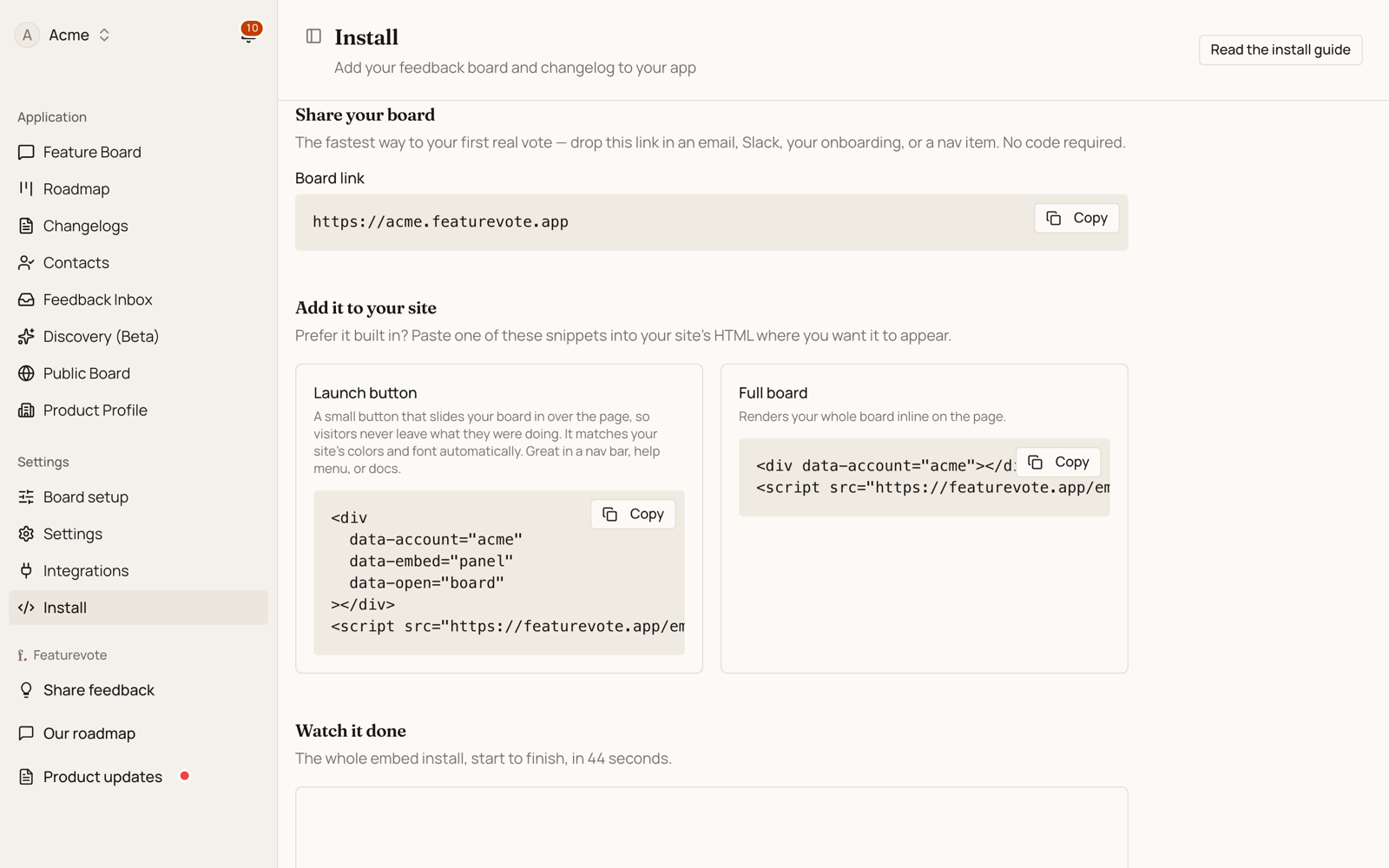
There are four ways to put Featurevote in front of your users, and one of them needs no code at all. Install and share in the sidebar gives you your board link at the top, then names the other shapes the same way this guide does and hands you the snippet for whichever you pick:
| Shape | What your visitors see |
|---|---|
| Feedback bubble | A bubble in the corner of every page. One line, nothing to place. |
| Share a link | Nothing installed — your board at its own address. |
| Your own button | A button you place, opening a panel over the page. |
| Board in the page | The board rendered inline, like any other section. |
Start with the link if you just want a first vote today. Everything else is one script tag away.
Feedback bubble: the one-line install
Paste this anywhere in your site's HTML. Before the closing </body> tag is the usual spot, and a site-wide layout means every page gets it:
<script src="https://your-account.featurevote.app/embed.v2.js" data-account="your-account" async></script>
Replace your-account in both places with your own — it is the first part of your board address, and the two must match. Loading the script from your board's own address rather than ours is what keeps the next section to a single origin.
A small glass bubble appears in the bottom-right corner. It opens a card above itself, straight on the idea box, with a tab bar along the bottom (Feedback, Ideas, Roadmap and Updates), so visitors never leave the page. The Roadmap and Updates tabs follow the Show roadmap and Show changelog settings. Until an idea is on the roadmap or an update is published, they lead to Ideas. There is nothing to place and nothing to style.
The bubble has no colour of its own. It darkens whatever sits behind it, so it takes the character of your page rather than dropping a brand colour on top of it, and it works the same on a white page, a dark app or a photo.
Optional attributes on the same tag: data-position="left" moves the bubble to the other corner, data-label sets the name screen readers announce, data-open="board" opens on the request list instead of the idea box, data-panel-style="drawer" swaps the card for the edge drawer a placed button opens, and data-email / data-name pass the signed-in user (see Passing user identity). From your own CSS, --fv-offset and --fv-z-index reposition it, and --fv-ink sets the outline colour, and the tint on browsers with no backdrop-filter.
The bubble sits at z-index: 40. That keeps it above your page content and below your own dialogs and modals, so an open dialog covers it. If something else in that corner covers the bubble, like a cookie banner or a sticky footer, raise --fv-z-index or move the bubble with --fv-offset.
If your page already has a container of its own (the shapes below), the tag renders no floating button. The container wins.
On React, Next.js, Vue or any other framework that builds the page in JavaScript, the same one line goes in your root layout. See Frameworks (React, Vue, SPAs) for the example.
Share a link
The fastest way to collect your first vote. Copy your board link and drop it anywhere — an email, a Slack message, your onboarding flow, or a nav item.
https://your-account.featurevote.app
Point people at your product updates instead by adding ?tab=changelogs:
https://your-account.featurevote.app?tab=changelogs
With Known issues on, ?tab=issues opens your list of open bugs the same way.
Because it's just a link, you can build your own button or menu item and style it however you like — no widget required. To pre-fill the voter's identity, add query params (see Passing user identity below).
Your own button
A button you place yourself, opening a panel over the page. It comes in two shapes — the difference is one attribute, and which one you want depends on whether you would rather collect a new idea or have people find the one already there.
Opening the feedback form
Straight to the form on its own: no list, no votes, nothing to read first. Paste it where you want the button to appear:
<div data-account="your-account" data-embed="panel" data-open="ask"></div>
<script src="https://your-account.featurevote.app/embed.v2.js" async></script>
data-embed="panel" slides your board in over the page. A visitor halfway through writing something, or three levels into your app, can leave feedback and carry on — no page load, nothing lost. Use data-embed="launcher" instead if you'd rather send them to the board as a normal page.
Opening the full board
Swap data-open="ask" for data-open="board" and the panel opens the board itself, so a visitor on your pricing page or in your app can read what others have asked for and upvote it in place, then carry on where they were — which is also how you stop collecting the same request five times:
<div data-account="your-account" data-embed="panel" data-open="board"></div>
<script src="https://your-account.featurevote.app/embed.v2.js" async></script>
Voting is a single click. It needs no account and no email unless you set Visitor email to To vote, post and comment in Settings → Access and submissions. Posting a new request asks the visitor for an email, unless you set Visitor email to Not needed.
Keep data-embed="panel" either way. Without it the snippet renders the full board inline in the page instead — that is Board in the page below.
Launcher options
Add these attributes to the <div> to change what the button does and how it reads:
| Attribute | Values | Default | What it does |
|---|---|---|---|
data-embed | panel, launcher | — | panel opens the board in a slide-in drawer; launcher navigates to it. |
data-open | board, ask, changelogs | changelogs | What the button opens: the board, a quick "suggest a feature" box, or your product updates. Works on Board in the page too, where leaving it out keeps the board's normal view. |
data-label | any text | per mode¹ | Overrides the button text. |
data-target | _self, _blank | _self | Open in the same tab or a new tab. Ignored by panel, which opens in place. |
data-panel-style | drawer, card | drawer | drawer slides in from the edge and dims the page; card sits above the button with the page live around it. |
data-panel-side | right, left | right | Which edge the panel slides in from. |
data-panel-width | any CSS size | 420px | Panel width on desktop. Phones always get a full-screen sheet. |
data-email / data-name | a value | — | Pre-fills the visitor's identity (see Passing user identity). |
data-access-key | your access key | — | Required only if your board is set to Hidden (see Hidden boards). |
¹ The default label depends on the mode: Request feature (board), Give feedback (ask), View updates (changelogs).
How the panel behaves
data-open="ask"opens on the idea box, with the tab bar along the bottom. What visitors write there goes on your Feedback Portal as an idea, where others can vote on it.- Message the team instead, a link under the form, sends a private message to your Feedback Inbox. It never appears on the board and gets no votes.
If you've turned Issue reporting off in Settings → Access and submissions, that link is hidden and the idea box is all there is.
data-open="board"/"changelogs"show the board itself in the drawer, so people can read and vote on what's already there.Closing it: the ✕ in its header, a click on the dimmed page behind it, or the Escape key. The bubble's card doesn't dim the page, so there it's the ✕ or Escape. After a submit the panel shows a confirmation with View your idea and Done, and stays open until the visitor picks one. (In
data-open="board"mode, Escape works while focus is on your page; once the visitor clicks into the board itself, use the ✕ or the dimmed area.)It can't be covered or clipped. The panel renders in the browser's top layer, so your
z-indexvalues,overflow: hiddenwrappers andtransformed ancestors don't affect it — the button is safe to put anywhere, including inside your own modal.If your site sends a
Content-Security-Policy, the script and the board it opens come from the same origin, so the two directives that name us take the same value:script-src https://your-account.featurevote.app; frame-src https://your-account.featurevote.app;
script-srcis what lets the snippet load at all — without it nothing happens and there is no error of ours in the console, because our code never runs.frame-srcis what lets the board open inside the panel. Without it the panel shows a link that opens the board in a new tab instead, and the browser console names the exactframe-srcvalue to add. (The same applies to the inline board embed.)Those two are the whole list. The embed makes no background requests, so it needs no
connect-src, and it styles itself with a constructed stylesheet rather than an injected<style>, so a strictstyle-srcleaves it alone. The one exception is a browser without constructable stylesheets (Safari below 16.4), where it falls back to a<style>element — if you support those and yourstyle-srchas no'unsafe-inline', the button renders unstyled there.
You don't have to hand-write any of this. On the Install and share page, pick one of the two Your own button shapes, then open Customize → Customize the launch button. It sets the button label and the visitor's name and email, and copies the finished snippet for you. The mode comes from the shape you picked.
Styling — it already matches your site
By default the launcher inherits your site's text color and font, so it blends in on light and dark pages with no styling needed.
The launcher renders inside an isolated shadow root. That means two things:
- Your page's CSS can't accidentally reach in and break the button — and the button's CSS can't leak out and affect your page.
- Because of that isolation, you can't style it with ordinary selectors. Instead, the launcher exposes a deliberate, stable hook you're meant to target from your page's stylesheet.
This section is about a launcher you place yourself. The one-tag floating bubble is a different object: it has no fill to colour, so --fv-bg and --fv-text do nothing there. It still answers to ::part(button), and adds ::part(glass), ::part(ring) and --fv-ink. Note that [data-account] matches the floating host too, so scope brand CSS with [data-account]:not([data-featurevote-floating]) if you use both.
Two ways to theme it — pick based on how far you want to go:
1. Colors only — the --fv-* custom properties. The quickest option. Set these on the container and they flow through the shadow boundary into the button. Good when you just want brand colors:
[data-account] {
  --fv-bg: #4f46e5;   /* button background */
  --fv-text: #ffffff; /* button text + icon */
}
2. Full control — the ::part() selector. The launcher tags its button as part="button", which you can style like any element — including states like :hover. Use this when you want to change shape, padding, radius, or anything beyond color:
[data-account]::part(button) {
  background: #4f46e5;
  color: #ffffff;
  border-radius: 9999px;
  padding: 10px 18px;
  width: auto; /* the default is a full-width row; opt into a compact button */
}
[data-account]::part(button):hover { background: #4338ca; }
Theming the panel. The slide-in panel is a separate element that mounts itself on <body>, so it has its own hooks:
[data-featurevote-panel] {
  --fv-panel-width: 520px;                  /* desktop width */
  --fv-panel-bg: #ffffff;                   /* panel background */
  --fv-panel-text: #0f172a;                 /* header text */
  --fv-panel-backdrop: rgba(0, 0, 0, 0.6);  /* the dimmed page behind it */
}

/* …and ::part() for anything beyond color, as with the button: */
[data-featurevote-panel]::part(panel) { box-shadow: none; }
[data-featurevote-panel]::part(panel-close) { border-radius: 9999px; }
You can combine both — set the --fv-* colors and reach for ::part() only where you need more.
A note on shape: the default is a full-width row, designed to sit in a sidebar or nav column. For a compact inline button, set width: auto on ::part(button) as shown above.
Board in the page
Render your entire board inline, with no button and no panel — great for a help center, product portal, or internal dashboard. This is what a /feedback or /roadmap page on your own site is made of.
<div data-account="your-account"></div>
<script src="https://your-account.featurevote.app/embed.v2.js" async></script>
Optional sizing:
<div
  data-account="your-account"
  data-width="100%"
  data-height="600px"
  data-border="1px solid #e5e7eb"
></div>
<script src="https://your-account.featurevote.app/embed.v2.js" async></script>
Any CSS size works (600px, 80vh, 100%), and embed.v2.js treats a bare number like 760 as pixels. (On the legacy embed.js, always include a unit.)
The full-board embed also honors data-open (on embed.v2.js). Set data-open="changelogs" to open the embedded board directly on your product updates — handy when the embed lives on a "What's new" page:
<div data-account="your-account" data-open="changelogs"></div>
<script src="https://your-account.featurevote.app/embed.v2.js" async></script>
Unlike the launcher, there is no default here: leave the attribute out and the embed opens on the board's normal view, exactly as before.
Passing user identity
If your app knows who the visitor is, pass their name and email so the feedback form is pre-filled and their votes stay theirs on the next visit.
The two placeholders below are holes to fill from your own session, not values to paste. Left as they are, every visitor arrives as the same person and nothing reports it.
On a link, add query params:
https://your-account.featurevote.app?email={{SIGNED_IN_USER_EMAIL}}&name={{SIGNED_IN_USER_NAME}}
On a launcher or board embed, add data attributes:
<div
  data-account="your-account"
  data-email="{{SIGNED_IN_USER_EMAIL}}"
  data-name="{{SIGNED_IN_USER_NAME}}"
></div>
<script src="https://your-account.featurevote.app/embed.v2.js" async></script>
Hidden boards
If your product is behind a login, you may not want your board on the open internet. Settings → Access and submissions has four levels; these are the three that keep the embed working:
| Public | Unlisted | Hidden | |
|---|---|---|---|
| Your users, through the embed | yes | yes | yes |
| A stranger who has the link | yes | yes | no |
| Google and other crawlers | yes | no | no |
Public is the default. On Hidden, copy the access key from the same screen and add it to your embed:
<div
  data-account="your-account"
  data-email="{{SIGNED_IN_USER_EMAIL}}"
  data-name="{{SIGNED_IN_USER_NAME}}"
  data-access-key="k_7Qm2xR9vTb4Lp"
></div>
<script src="https://your-account.featurevote.app/embed.v2.js" async></script>
That is the whole integration. Nothing to generate per user, nothing that expires, no server code.
Checking it works
Open your board's own URL — https://your-account.featurevote.app — with no key on the end. You should get "This board is hidden". That is exactly what a stranger with the link sees.
The check is reliable from any browser, including the one you just tested your own site in: nothing is remembered between visits, so the board decides on the key in the URL alone every time.
Two things worth knowing before you rely on it:
- It stops strangers, not insiders. Anyone who can load your page can read the key in its source, and your own users can pass the link on. Use Regenerate on the access key if one gets out — the old key stops working within a few seconds, and you re-paste the new one.
- It hides the board page, not the data behind it. Someone who knows how the API works can still read a hidden board's contents. That is why it is called Hidden and not Private.
Frameworks (React, Vue, SPAs)
There are two ways in, and the one-line install is the simpler of them.
The one line, from a root layout
Render the script tag itself, with its data-account attribute, and you get the floating feedback bubble with nothing to place. In Next.js that means next/script:
// app/layout.tsx
import Script from 'next/script';

export default function RootLayout({ children }) {
  return (
    <html>
      <body>
        {children}
        <Script
          src="https://your-account.featurevote.app/embed.v2.js"
          data-account="your-account"
          strategy="afterInteractive"
        />
      </body>
    </html>
  );
}
Two things make this work, and both are worth knowing before you trust it:
next/scriptpassesdata-accountstraight through to the rendered<script>element. Data attributes are not stripped.document.currentScriptis null for a tag React renders, so the embed does not rely on it. It scans the page for a script tag carryingdata-accountinstead, and reads the account off that.
Keep strategy="afterInteractive". The floating bubble mounts on <body>, so a tag that runs before the body exists has nothing to attach to. This is the same installation we run on featurevote.app itself.
The optional attributes from Feedback bubble go on the same <Script>. Left off, the bubble keeps its own defaults, which are the Feedback name for screen readers and the idea box.
Any framework that can render a <script> tag with attributes works the same way. If yours cannot, put the one line in the HTML template your build starts from.
Apps with a signed-in area
A root layout is the right place on a marketing site, where every page is public. In a product it usually is not. The same root layout wraps your sign-in screen, your billing settings and every page rendering a customer's data, so a tag placed there loads third-party JavaScript into documents that hold passwords and account details.
Mount it on your authenticated subtree instead — the layout that already sits behind your auth check — and keep it off the auth routes themselves. In Next.js that means the layout inside your app group rather than the root one:
// app/(app)/layout.tsx — behind the auth check, not app/layout.tsx
<Script
  src="https://your-account.featurevote.app/embed.v2.js"
  data-account="your-account"
  strategy="afterInteractive"
/>
You give up nothing by doing it this way. A signed-out visitor on your login screen has nothing to give feedback about, and your signed-in pages are where the feedback actually comes from — it is also where data-email and data-name have a user to pass. If you want the bubble on your marketing pages too, add the tag to that layout separately rather than hoisting it back to the root.
Placing the container yourself
Load the script the same way, then initialize your own container after it mounts:
import { useEffect, useRef } from 'react';

function FeatureLauncher() {
  const ref = useRef(null);

  useEffect(() => {
    const init = () => window.FeatureVote?.initEmbeds(ref.current);
    init();
    window.addEventListener('featurevote:embed-ready', init, { once: true });
    return () => window.removeEventListener('featurevote:embed-ready', init);
  }, []);

  return (
    <div ref={ref} data-account="your-account" data-embed="launcher" data-open="board" />
  );
}
The same pattern applies to Vue (template ref + onMounted) and other frameworks — call window.FeatureVote.initEmbeds(el) once the container is in the DOM.
If the attributes change after that first render, which is the normal case when your session loads asynchronously and data-email only arrives a moment later, set them and then rebuild:
el.dataset.email = user?.email ?? ''; // empty when signed out
el.dataset.name = user?.name ?? '';

window.FeatureVote?.reset?.(el);
window.FeatureVote?.initEmbeds?.(el);
The reset is the part that matters. On its own, initEmbeds skips a container it has already rendered into, so the new values are read only once the previous render is torn down — and nothing reports the difference. The launcher preview on the Install and share page uses this same sequence.
A container of your own always wins. When one mounts, the floating button steps aside, so you never end up with two ways in on the same page.
Platforms (WordPress, Shopify, Webflow…)
Any platform that allows custom HTML works. Look for a "Custom HTML" or "Embed Code" block and paste the snippet. On WordPress you can pass the logged-in user's identity:
<div
  data-account="your-account"
  data-email="<?php echo esc_attr( wp_get_current_user()->user_email ); ?>"
  data-name="<?php echo esc_attr( wp_get_current_user()->display_name ); ?>"
></div>
<script src="https://your-account.featurevote.app/embed.v2.js" async></script>
Not sure which to use?
Start with the link — it is the fastest path to your first real vote, and it needs nothing from your codebase.
Then add the feedback bubble if you want an entry point on every page and would rather not think about where to put it. Place your own button instead when you have a natural home for it already, like a nav bar, help menu or footer, or when you want it on some pages and not others. Reach for board in the page when the board is the page.
They are not exclusive. A bubble on every page and a full board on your /roadmap is a normal combination — the container always wins where it appears, so the two do not fight.